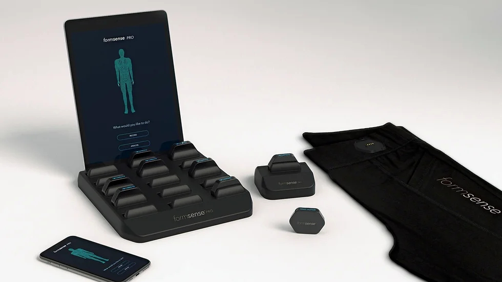
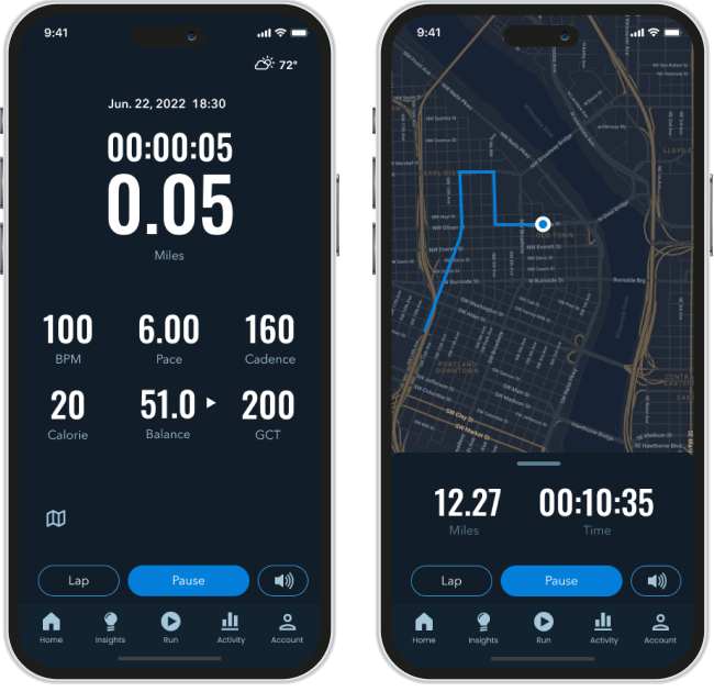
Over 20 proprietary sensors are seamlessly embedded within base-layer activewear to provide the most accurate measurement of biomechanics.
Our portable and interactive mission control app helps trainers benchmark players and assess injury risk any time, anywhere.
Our proprietary datasets and algorithms create real-time performance and injury correlations to enable data-driven decision making.
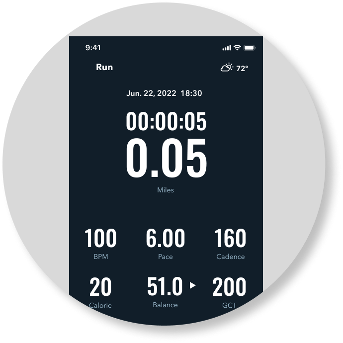
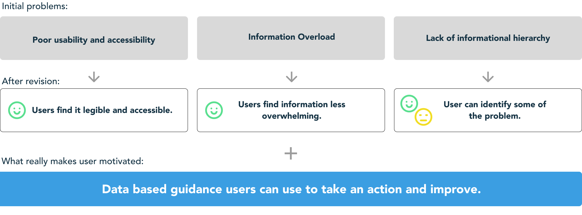
The contrast ratio was as low as 1.6, way below WCAG standard. It seems hard to see while running outdoor.
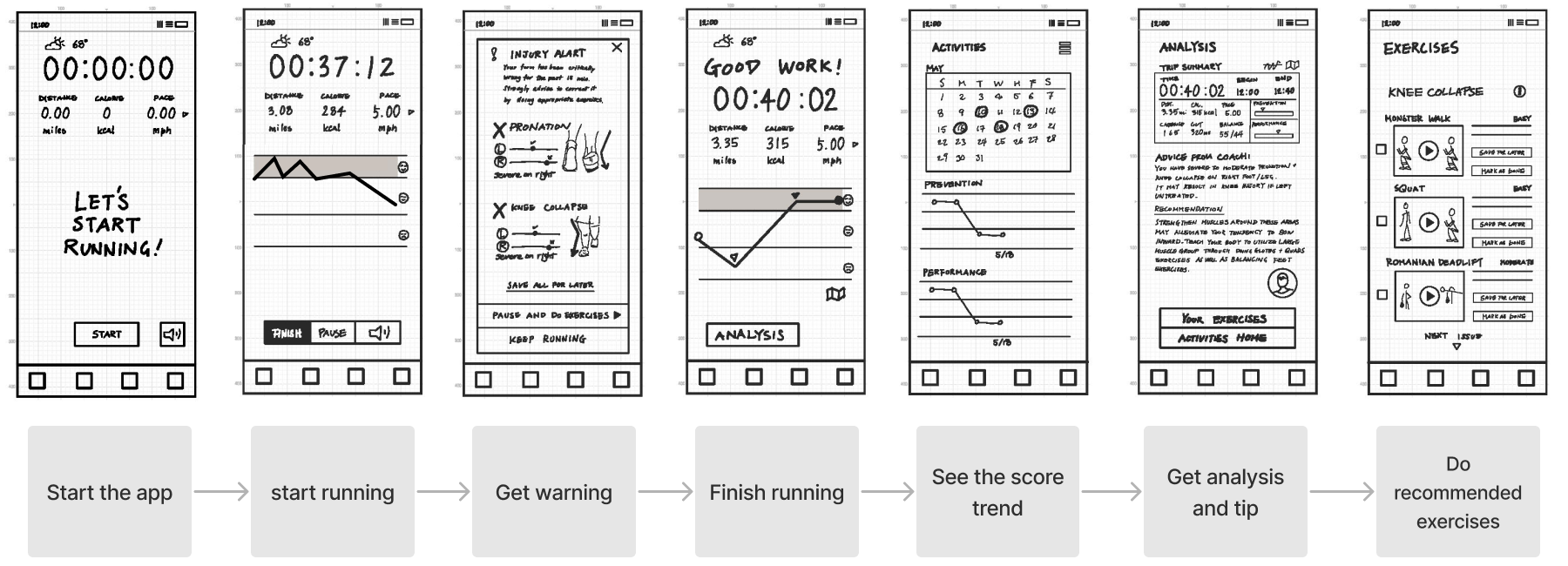
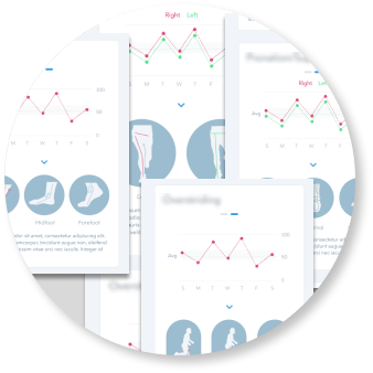
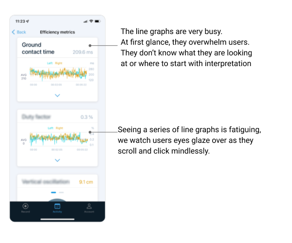
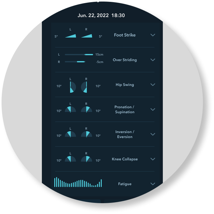
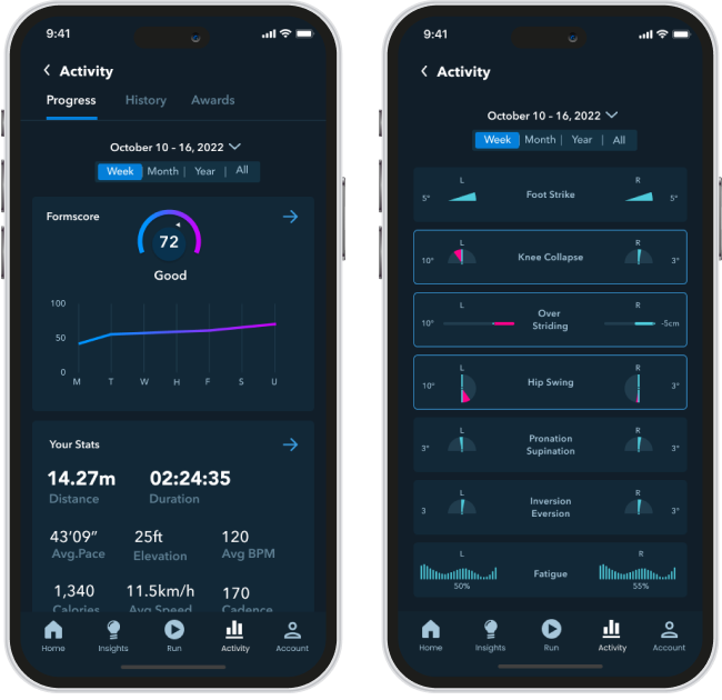
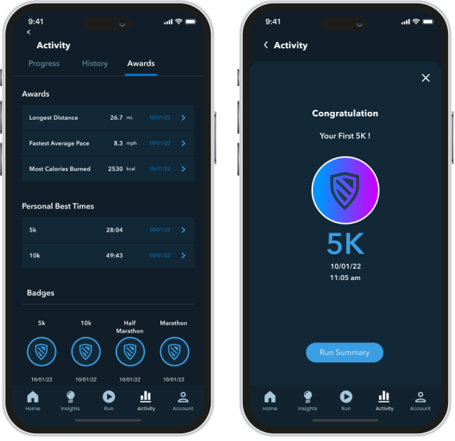
The existing design was showing various metrics in similar looking graphs all at once, seemed overwhelming.
Metrics on long scrolling screens seem hard to decipher which one matters the most for the particular user.
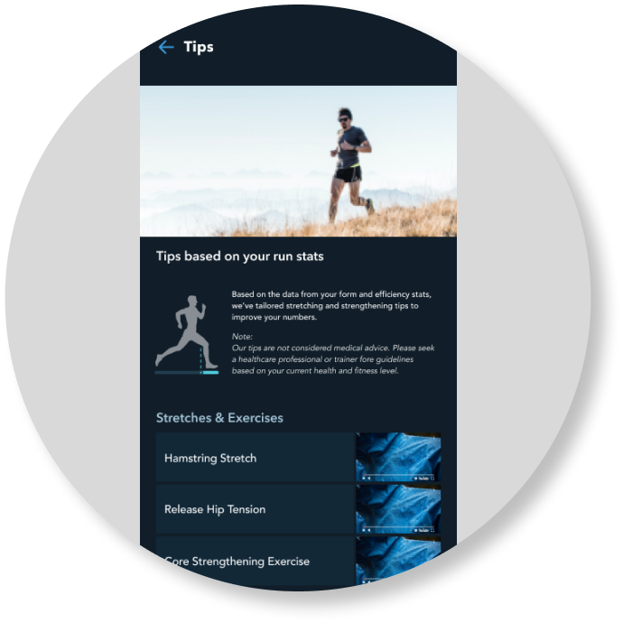
Based on these observation I have started preparing a revised version to be shown to users alowng the beta app. See lo-fi sketches in Appendix
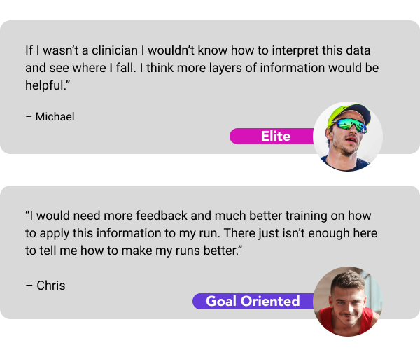
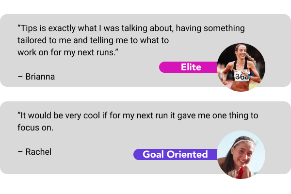
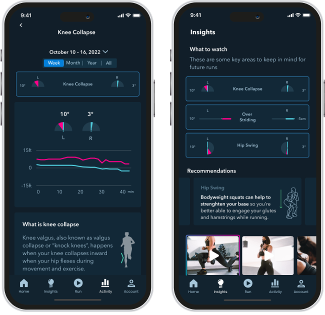
Goal Oriented and Elite users were more enthusiastic about the potential of this app. But even those who have knowledge of each metrics through PT and coaches thought it would be better if the app can illustrate what to focus and how.
Casual runners showed less interest in prevention because they have not run enough to experience injury, and if they did, they would simply stop running and pick something else. They found the app something beyond what they need at this moment.
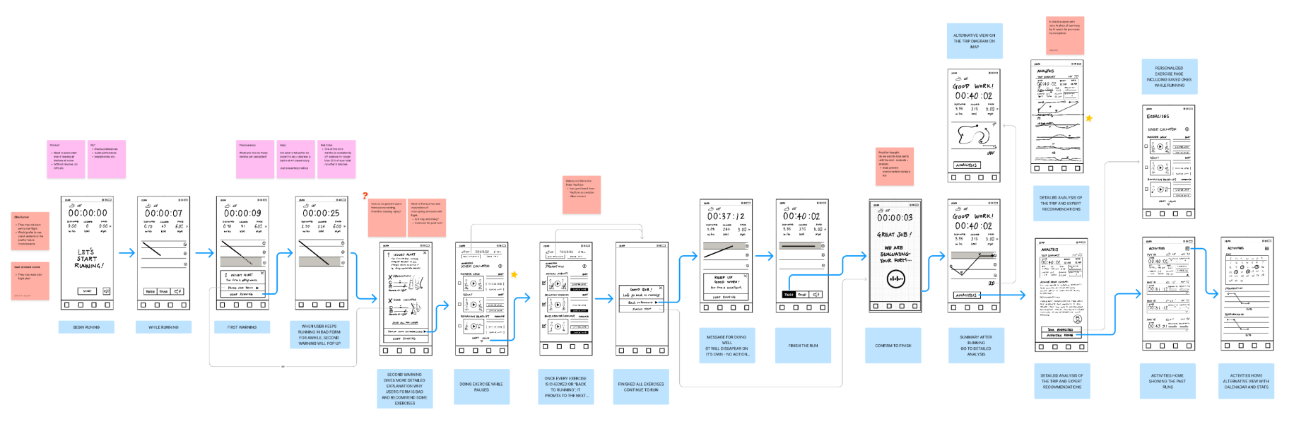
Prior to the user testing we briefly had an idea that this product may be good for a wider audience including casual runners, who may need more visual guidance and encouragement during the run. There was also an idea about mid-flight warning graph, which we decided to keep it audio only for fear of distructing runners. After the test we decided to focus on how to visualize activity analysis and insights.