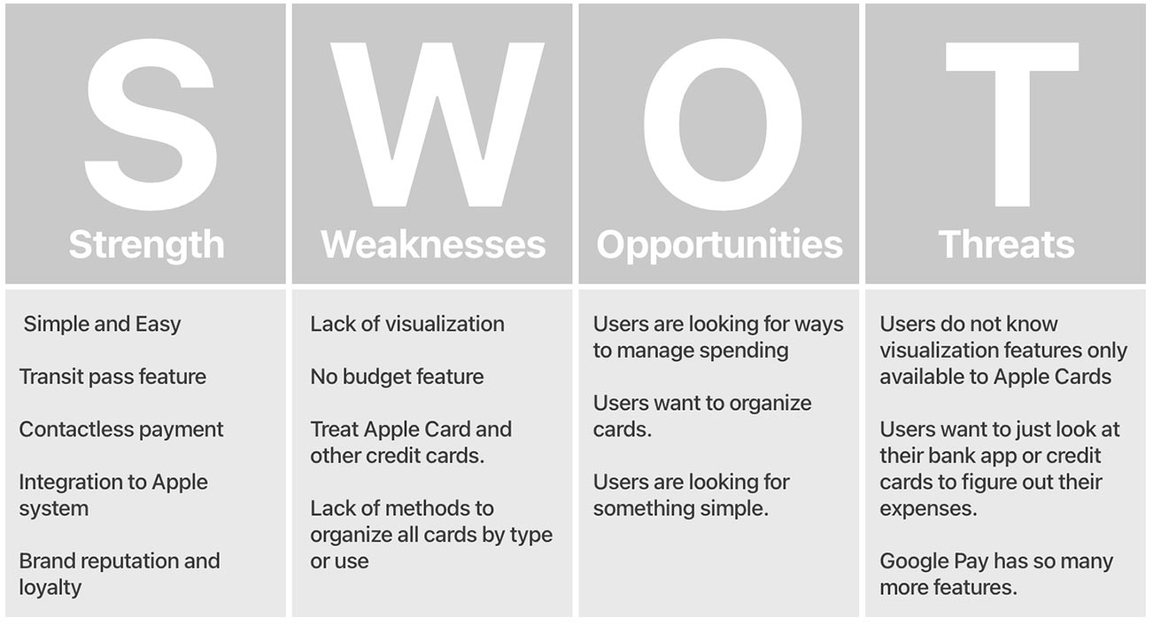
The basic design of Apple Wallet hasn't changed much since the conception. It is like a "wallet" letting users keep boarding passes, tickets, and reward cards on the user's phone. It is now also the main interface for Apple Pay. This simplicity may be frustrating for some users, for example, to keep track of their spending and organizing their passes.
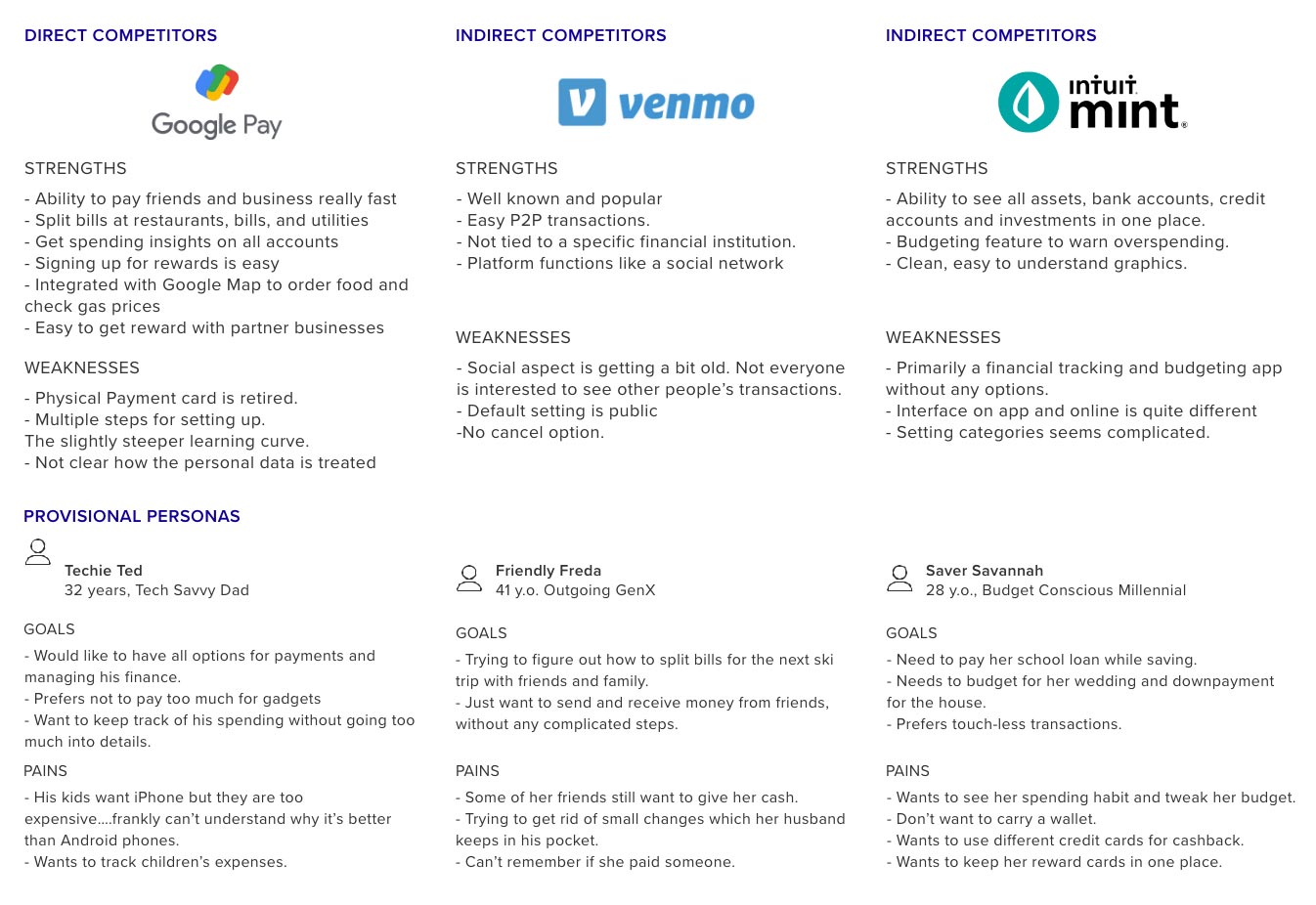
Google Pay, the most direct competitor for Apple Pay, recently got a major redesign with more emphasis on the social aspect of personal finance. iPhone users still prefer to use Apple Pay over because of its seamless plug-and-play setup. Mint is versatile; however, setting categories for tracking the expense could be tedious and complicated. Venmo is still very popular but the default public setting gives an impression that it is less private.
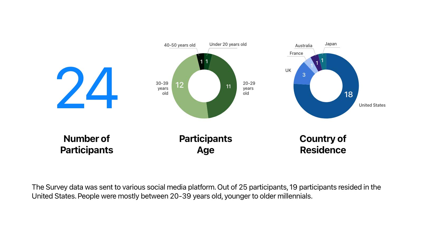
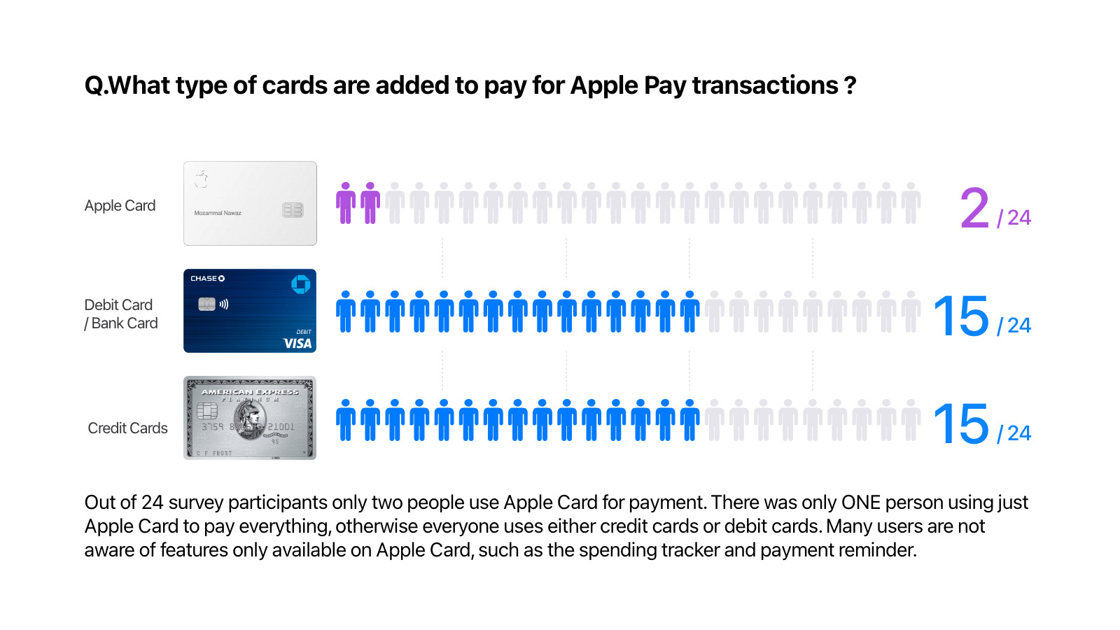
I decided to do a survey targeted specifically at Apple Wallet users and listen to their voice. The survey was taken by 24 participants and 18 of them live in the United States. They use it to pay for the meals, drinks, groceries, medicine, and household items.
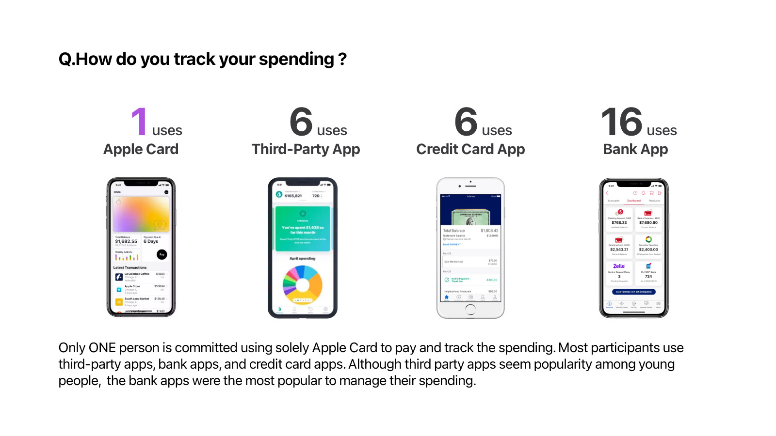
The bank apps in recent years have become quite sophisticated and easy to use. Those who prefer to use bank and credit card apps think these institutions are much more trustworthy, and hesitant to share information with a third-party app like Mint.


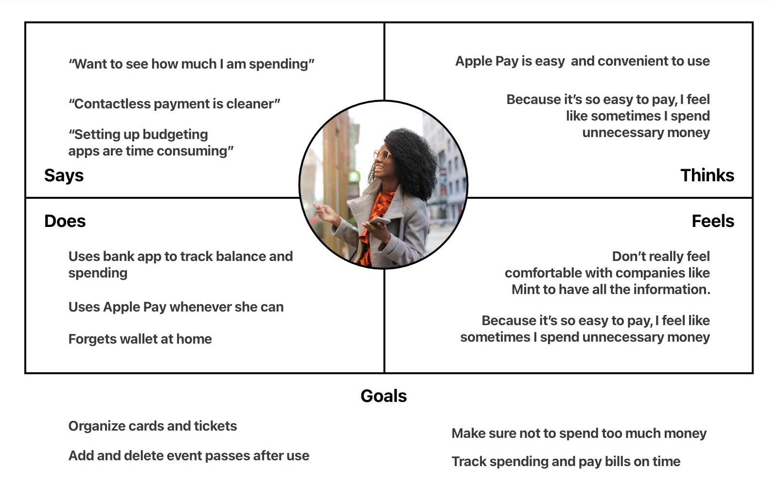
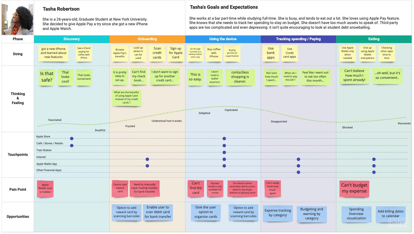
A persona was hypothesized to illustrate what her journey would be through interacting with the product. Tasha Robertson is a 26-years-old, graduate student at New York University. She decided to give Apple Pay a try since got a new iPhone and Apple watch recently.
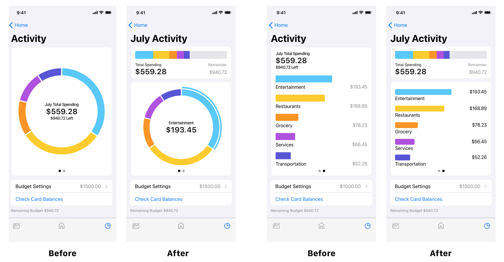
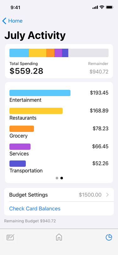
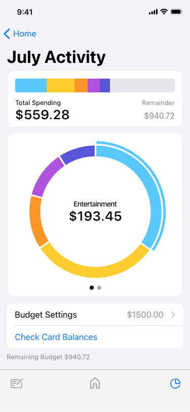
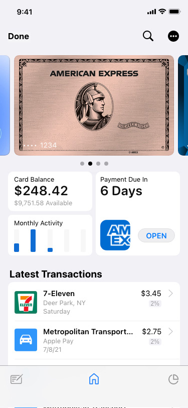
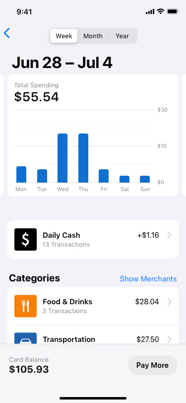
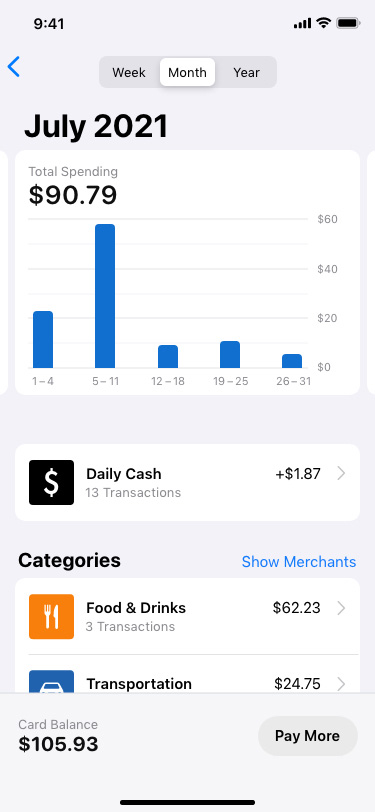
I first added the icons at the bottom of the screen. The style of icons were to match existing UI guidelines. Each icon represents "Edit Passes", "Home", and "Activity". The right icon leads users to the new Activity page, showing their overall and each category's spending trend. It also tells you how much is left for the budget.

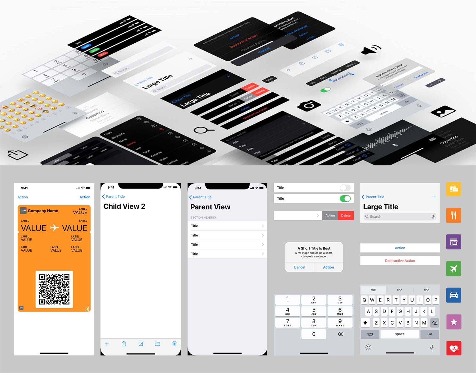
I have followed the guideline and used existing UI Kits for this project as a base design. From there, I have created several UI elements unique to this project in order to fulfill my goal of creating a budget tracking feature for Apple Wallet.
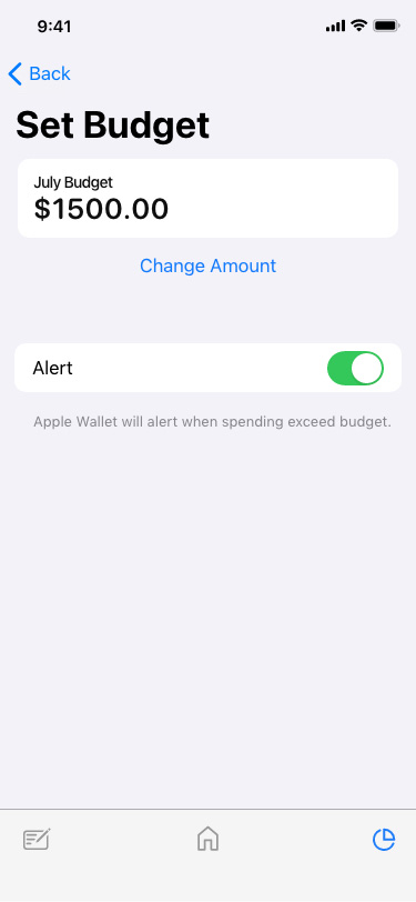
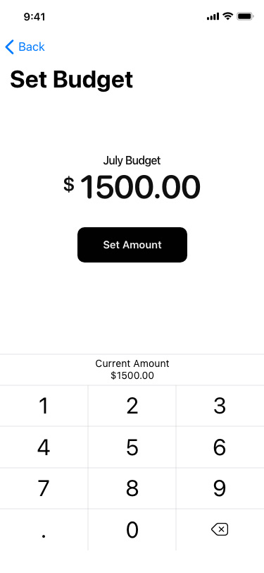
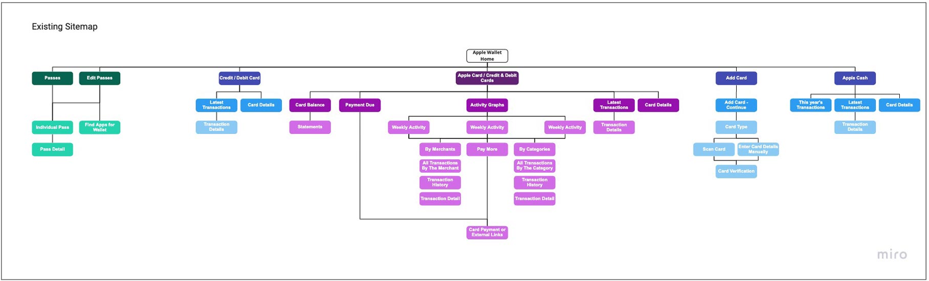
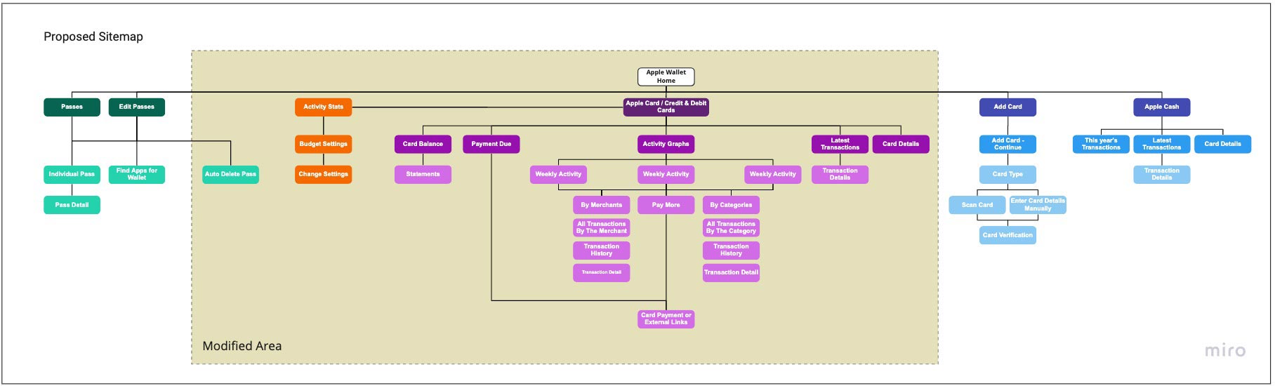
The project aims to add features integrating to the existing Apple Wallet system. The existing architecture allows only Apple Card to show financial activities. The proposed system expands that feature across all the linked cards, letting users set a budget and notifies the user a budget and notifies the user when spending is exceeded. Also for the passes, it allows archiving multiple passes and auto delete the ones expired.
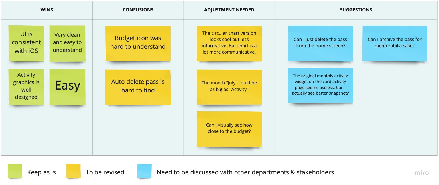
Usability test was conducted with 21 participants. Test takers are randomly selected. It included those who never used Apple Wallet.